Are Your Safety Signs Seen by Everybody?
Our society has become inundated with images of safety signs—on public transportation, in the workplace, in stores, on products, on equipment, and so much more. Unfortunately, these warning, danger, and general safety signs are not always easy to read and contain so much information that they are often not understood or simply ignored.
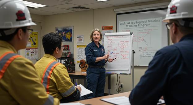
Additionally, are the signs understood by the exact populations who need to understand them? As more baby boomers in the workforce get older, creating signs that can be easily read is a big concern. According to a March 2016 NIOSH Productive Aging and Work article, “Today, one in every five American workers is over 65, and in 2020, one in four American workers will be over 55.” More than ever, it is important to create safety signs that will reach the more mature workforce’s needs.
Safety Sign Design Elements
A useful safety sign is seen, read, and understood when it is needed most. It causes people to act in a manner that will keep them safe. Good design strategically uses text, images, and color to ensure that safety signs can be easily identified, read, and understood.
Text
A sign should define the warning and potential consequence of not heeding the warning. In general, signs should be direct and clear, have the most important information towards the top, and use an easy-to-read font.

Be direct and clear: Warnings with ambiguity are less likely to be understood. For example, a sign that states “Danger: Pressurized Equipment” is vague. What is the hazard? What action must be taken? Instead, the sign could state “Danger: Keep Clear of Leaks! High-pressure oil will puncture skin, causing serious injury or death.” This is much clearer because both the required action (keep clear of leaks!) and danger (puncture hazard) are defined.
Place important information towards the top: In most cases, people scan from top to bottom, so the information you want someone to see first should be up top. The signal word (Danger, Warning, or Caution) should be placed at the top of the sign. The required action and explanation of the danger should follow.
Use an easy-to-read font: Selecting a sans-serif style like Verdana or Helvetica for your safety sign font will ensure that each line of text can be easily read. In addition, it is important to avoid only using uppercase text in a safety sign. Karen Schriver, a leader in visual communication, explains that text in “all caps” slows reading comprehension. She suggests using a mixture of “all caps,” title case, and sentence case to improve readability.
For example, use “all caps” for the signal word (DANGER), title case for the action statement (Keep Clear of Leaks!), and sentence case for the hazard statement (High-pressure oil will puncture skin, causing serious injury or death).
(Source: Schriver, Karen A. Dynamics in Document Design, 1997)

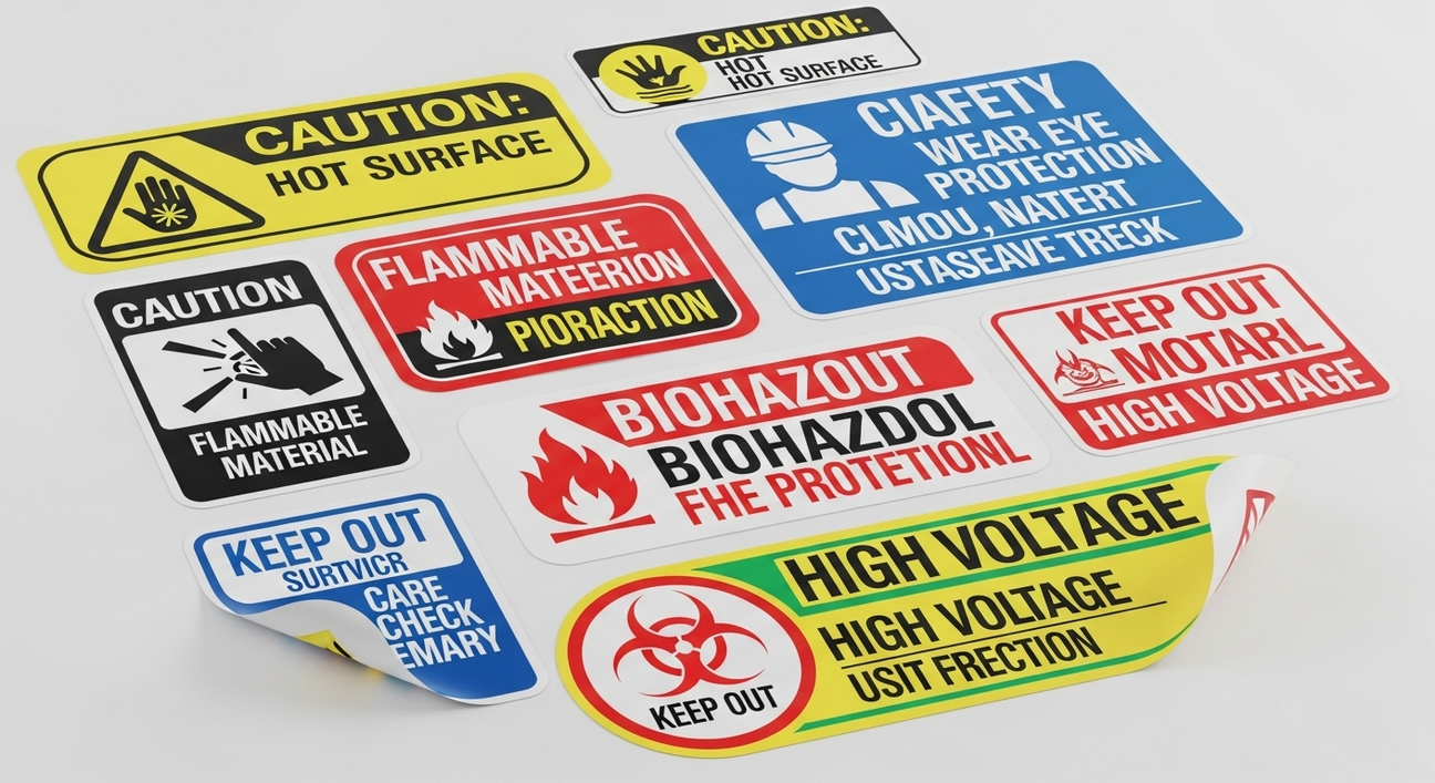
Images
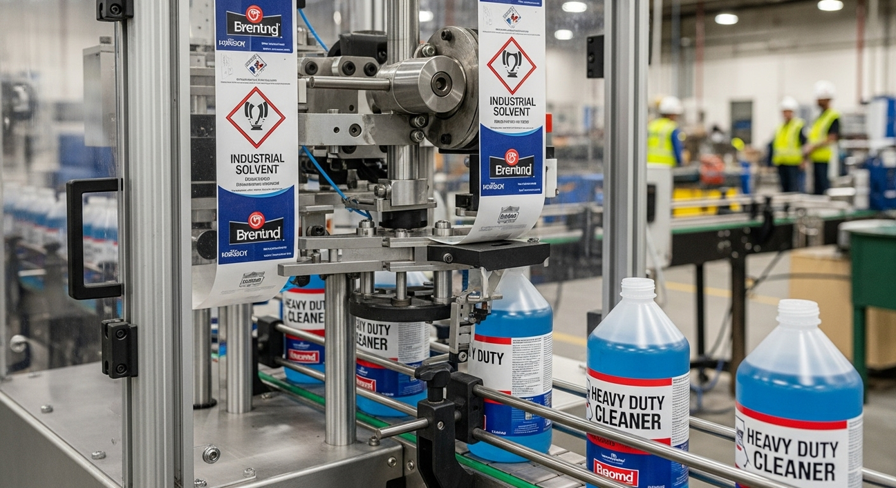
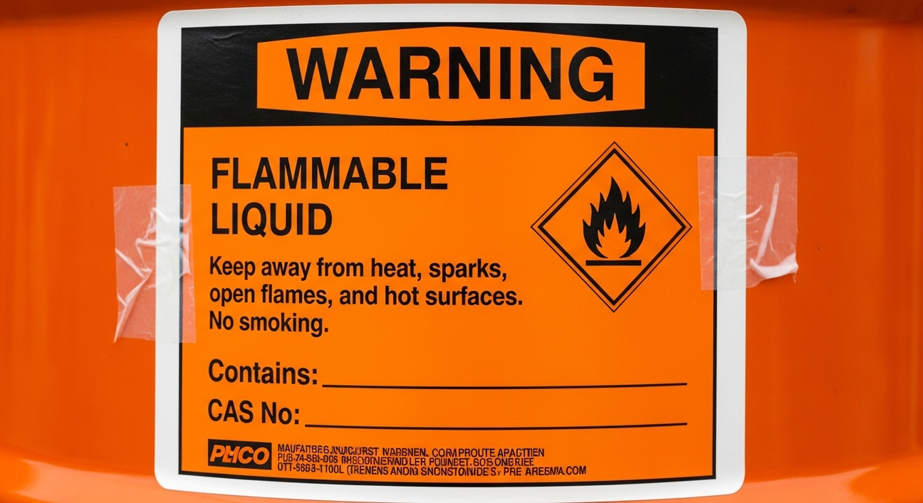
Safety sign images provide an effective method for communicating complex information and reducing confusion. The above example, “Danger: Keep Clear of Leaks! High-pressure oil will puncture skin, causing serious injury or death,” can be made even clearer when used with a supporting image. Adding an image that shows pressurized oil puncturing a figure creates an immediate sense of danger and increases comprehension.
Another advantage of images is that they can help safety messages reach diverse audiences. One person may have a different native language, or a young child may not be able to conceptualize the danger from words alone. Images help bridge the gap in understanding and drive the message home.
Color
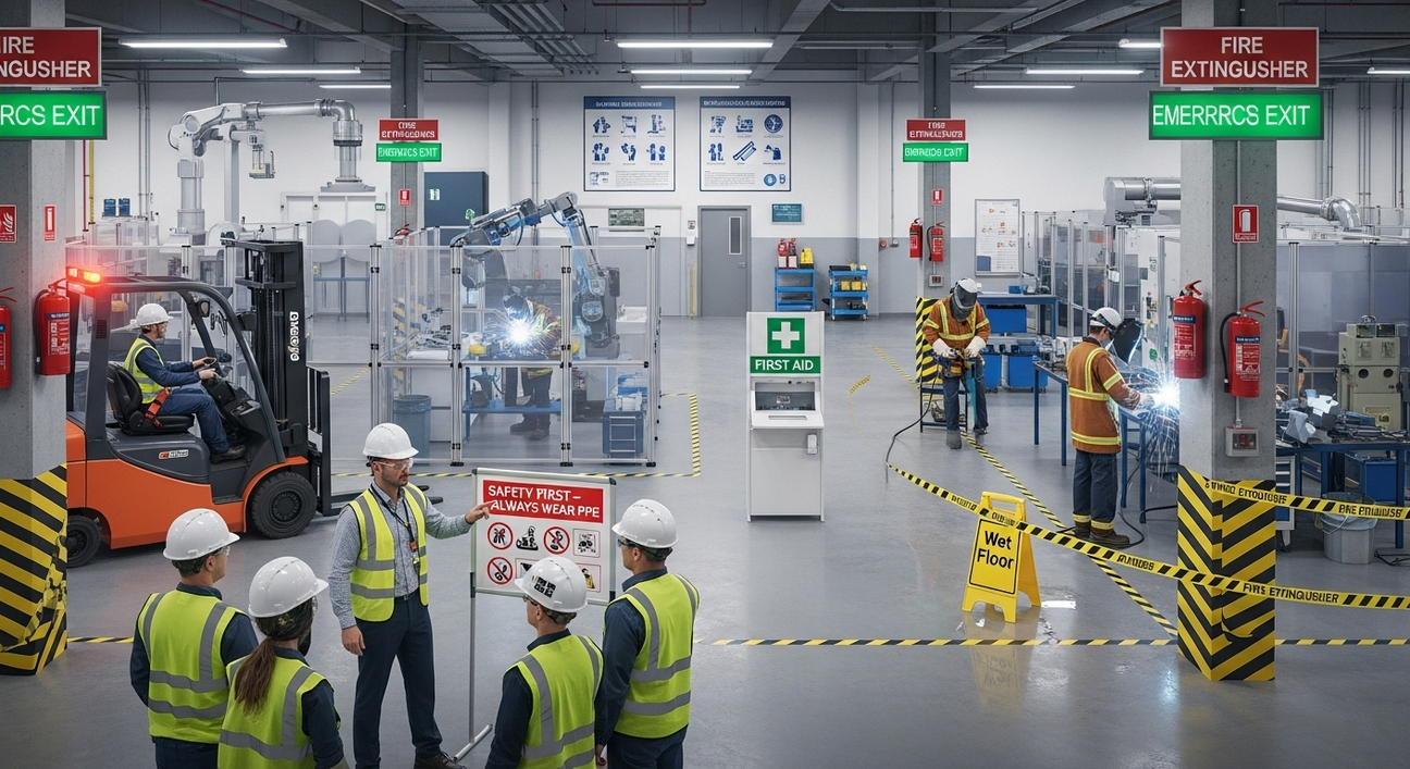
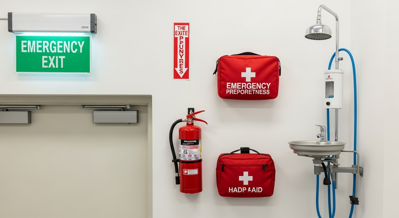
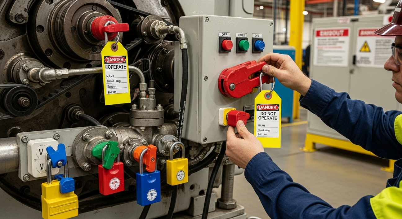
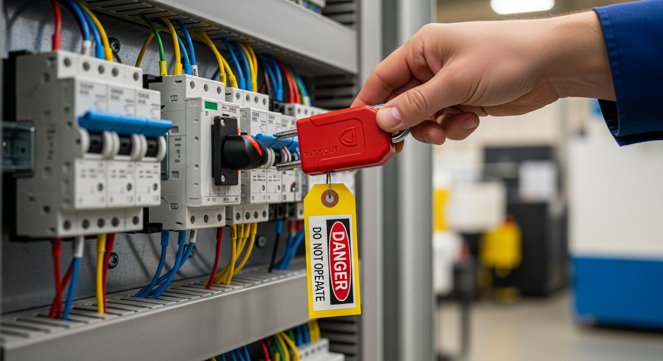
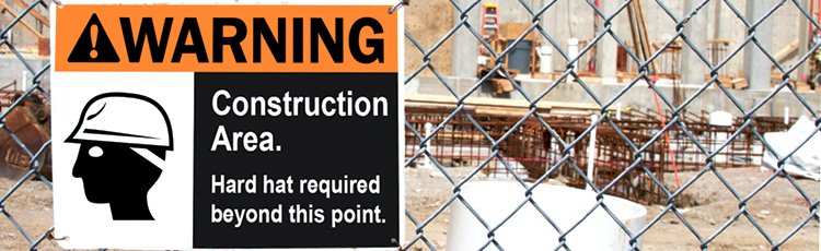
OSHA has specific recommendations about colors for danger, warning, and caution signs. Danger is red, Warning is orange, and Caution is yellow. While the average person may not distinguish a danger sign from a warning sign, it is important to follow established guidelines. This will help people recognize safety messages and their severity even when they move from one facility to another or one workplace to the next.

Goals for Safety Signs
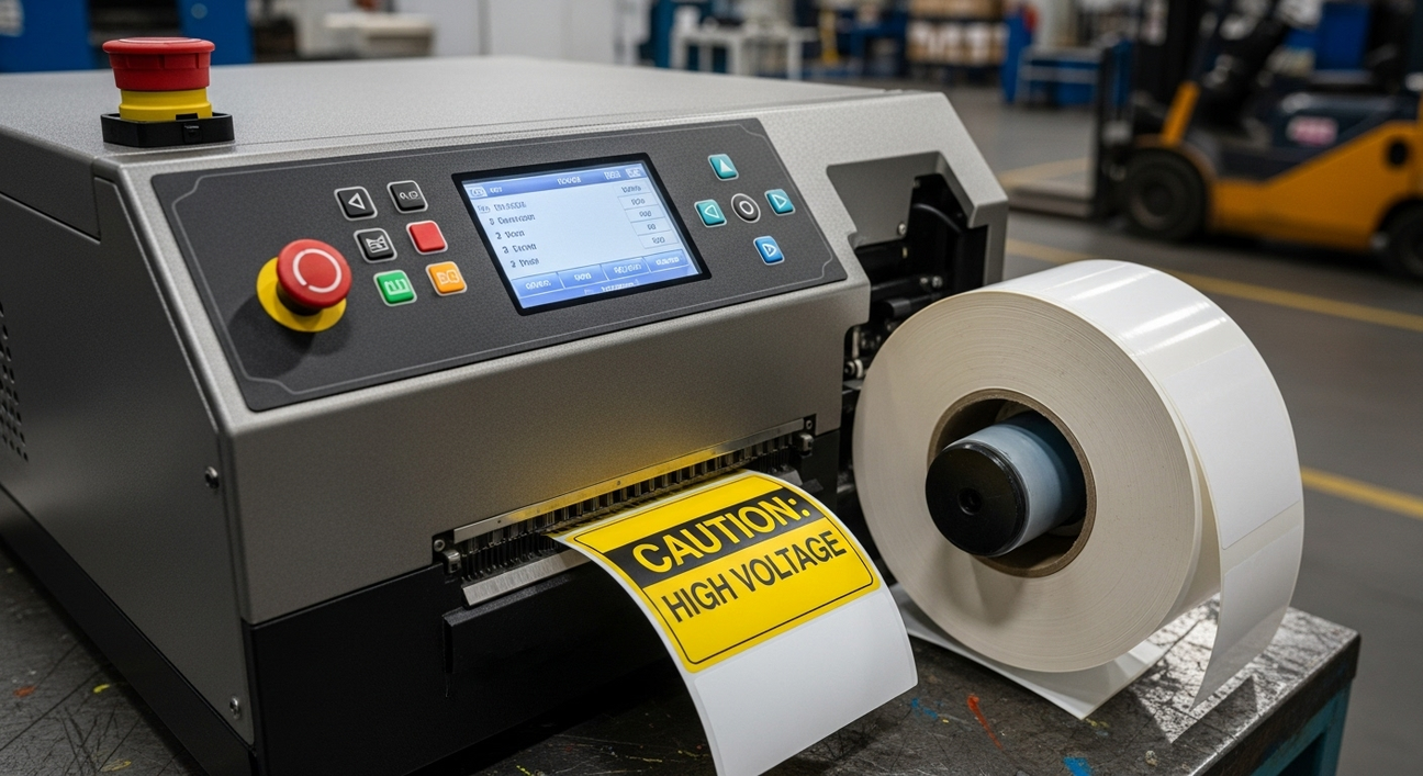
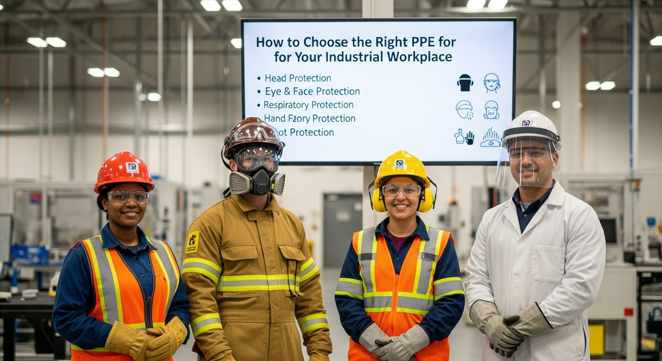
For a safety sign to be useful, it must first be seen. A well-designed but poorly placed sign will not do its job. At the same time, signs should use text, images, and colors to improve hazard recognition, comprehension, and compliance. Learn when signs are needed, how to comply with regulations, and what information is needed in your signs to keep people safe in the OSHA Safety Signs Best Practice Guide by Graphic Products.
Be Seen and Read
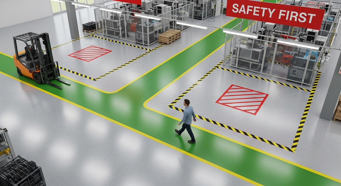
Marc Green, an expert in vision and perception, explains that “people typically focus attention in the same direction as the eyes point. This means that warnings not located close to the line of sight will not be readily seen.” Always place safety signs so that they will be readily seen from the normal point of approach.
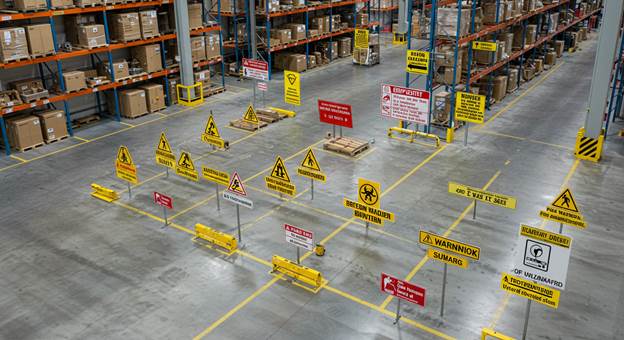
At the same time, it is important to avoid creating visual clutter by placing too many safety signs in the same area or posting signs too frequently. When an environment has too many signs, people are more likely to skip over one of them. The sign loses its visual weight and will not draw people’s attention away from their primary focus. Green refers to this as “Inattentional Blindness,” meaning it enables us to focus on our daily tasks without becoming overwhelmed by our environment. It is the safety sign’s job to interrupt that focus and draw attention to important information.
Once a sign is seen, it must be read. People are less likely to take the effort to read something when it is difficult to do so. A small warning sign with an even smaller font may be ignored, or in some cases, people may enter the hazardous area just so that they can read the sign. To reach the broadest audience possible, the safety sign must be tailored for its environment and the people who may encounter it. The sign’s size, font size, graphics, and color can help people quickly read information and avoid hazardous behavior. The sign must be large enough that it can be seen and read before the person enters the hazard zone.
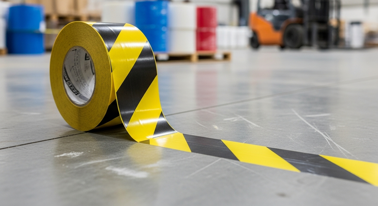
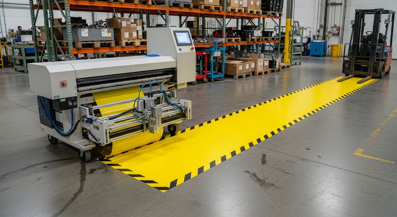
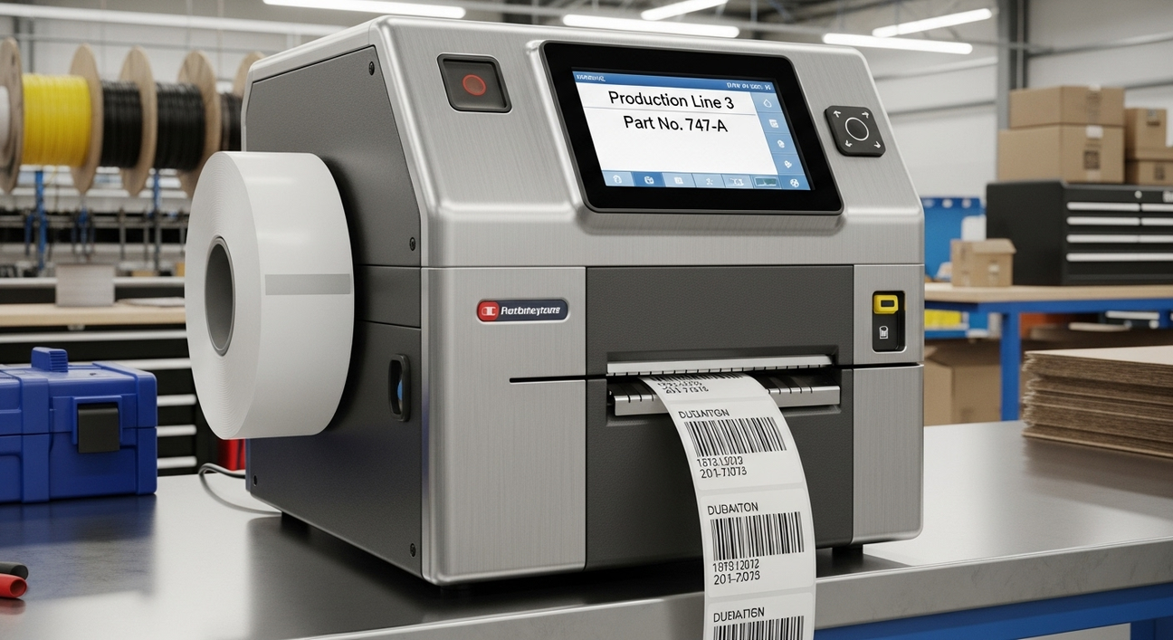
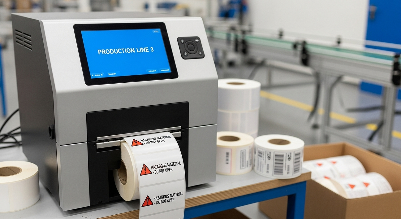
The above size viewing chart is based on the ANSI Z535-2007 standard. Using these recommendations will help to ensure that your signs will be seen and read by everybody, including the increasing number of baby boomers in the workforce. Create attention-grabbing signs using larger fonts, making it easy for older eyes to read the most important information with the DuraLabel 9000 by Graphic Products.

Creating a sign that can be widely understood is no simple task. A sign’s text, image, and color should work together to create the most concise and clear message possible, making the hazard and consequences absolutely clear. A sign that states, “Danger: Keep Clear! Rollers will crush and cause serious injury or death” will not provide a complete picture that can be understood by every viewer. What gets crushed? How does it get crushed? By adding a supporting image, this message can be made much clearer without adding additional text.
To be effective, signs must be designed to resonate with their intended audience. What may work for one group, may not work for another. This is why it is important to keep graphics simple to make the hazard clear, use concise text, and remember to use appropriate colors. You have the power to create signs for many hazardous situations with DuraLabel industrial label and sign printers by Archford Products. There are endless opportunities to apply safety signage that can offer some surprising and even hidden benefits.
Ensure your facility or work site is safe and compliant by downloading our free OSHA Safety Sign Guide below.